
 DapierDec 31, 2021
Build a sign up card with ReactJs using styled-components
 Build a sign in card form with React and styled-components
Lets start creating a react project call "card-form" , you can call whatever you want with the code below.
npx create-react-app card-formNice! you create your app, as far is good, to see your application running you must to run this command:
cd card-form npm startOnce this was compilad you will see something like this in your localhost in browser

Start coding
You must have installed a code editor, i suggest you Visual Studio Code, have a good extensions there are useful.
You only have to drag your file there was created after in your location to a new vs code window.

In react are straightforward create a components as Home page, Navbar and in this case will call own component "SignIn", to do this you must to delete default content inside App.js, we wont use this.

Once you deleted default content, you must to create SignIn component , or if you prefeer you can code inside App.js, this are a mainly file there will render all your app.
In this case i will show you how looks in a website using reactjs and styled-components
You must create inside "source" file, a new folder called "components", here will create 2 javascript files, on of them "Sign In" and another one "SignInSC", where "sic" means styled-components, you can call as you prefer, something like this:

Creating SignIn component
Lets create a component in SignIn.js
For efficeny you really need this vs code extensions:


This extensions will help us a LOT later.
For more interesanting extensions, maybe like this post:
So , lets create the component using previous extensions, like this:

* Notice there we working outside "App.js", so keep in mind this when want to see what we doing *
Check it out on our App.js to renderize our SignIn component:
App.js
import "./App.css"; import { BrowserRouter as Router, Route, Routes } from "react-router-dom"; import SignInCard from '../components/SignIn/SignIn' function App() { return ( <div className="App"> <Router> <Routes> <Route path="/signin" element={<SignInCard />} /> </Routes> </Router> </div> ); } export default App;Notice there i import BrowserRouter, Route and Router, that why im using differents routes for many components
So far we don't use styled-components yet, so lets create a components in SignIn.js, this components will work with their later in styled-components.
Lets create a structure:
SignIn.js
function SignInCard() { return ( <Container> <Card> </Card> </Container> ) } export default SignInCardRealize there im create <Container> and <Card> component instead html tags. This new tags are components, we need to exported in SignInSC.js, or if you prefer create in SignIn.js self.
In my case im gonna create those components using styled-components.
How to use styled-components to center a div?
its pretty simple, how i said, im gonna use SignInSC.js, and we have to import this package in SignInSc.js :
import styled from "styled-components";You must to install this package previously , just copy this command in cmd (in your react project) and paste it
npm install --save styled-components
Once you installed and imported in SignInSC.js lets add css to container like this:
import styled from "styled-components"; export const Container = styled.div` width: 100%; height: 1000px; display: grid; place-items: center; background: rgb(224,236,234); background: linear-gradient(39deg, rgba(224,236,234,1) 35%, rgba(255,253,246,1) 75%); `;As you can see, im define Container as div, you can define with another html tag there you need.
In this case we just need define the measure of container, after that just add css grid with display: grid an center with place-items:center; , pretty easy and quick!.
Don't forget Card component to see this center div!
import styled from "styled-components"; export const Container = styled.div` width: 100%; height: 1000px; display: grid; place-items: center; background: rgb(224,236,234); background: linear-gradient(39deg, rgba(224,236,234,1) 35%, rgba(255,253,246,1) 75%); object-fit: cover; `; export const Card = styled.div` display: flex; max-width: 80%; height: 700px; border-radius: 2rem; background: #fff; box-shadow: 16px 15px 15px -9px rgba(0,0,0,0.1); @media screen and (max-width: 768px){ font-size: 3.4em; } @media screen and (max-width: 480px){ flex-direction: column; } `;adding in this display:flex to use as boxes instead a grid, and adding some attributes.
Now, remember when you create a component outside you must to import to main file, in this case SignIn.js:
SignIn.js
import { Container, Card} from './SignInSC' function SignInCard() { return ( <Container> <Card> </Card> </Container> ) } export default SignInCardLets see how looks:

Awesome, now lets five more style.
Adding more content & styles to card
SignIn.js
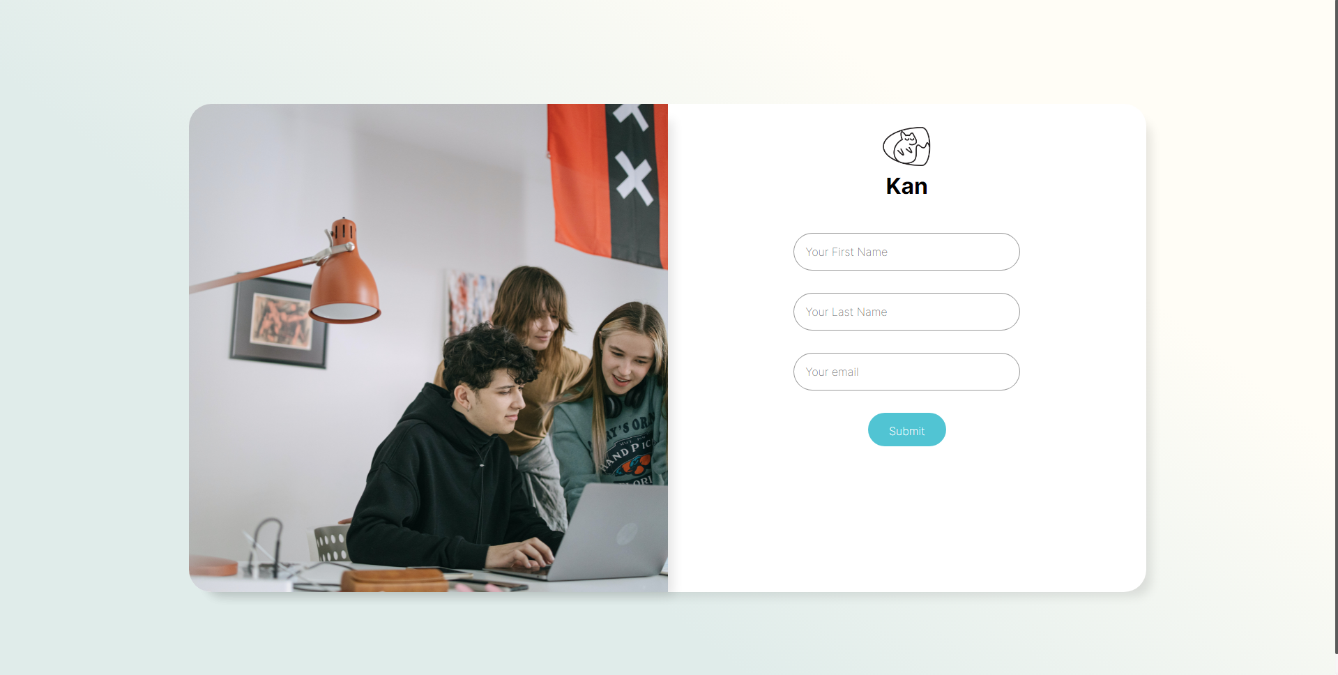
import React from 'react' import TeamworkPhoto from './../../images/teamwork.jpg' //Logo import Logo from '../../images/Logo.png' //styledcomponents import { Container, Card, Col1,Image ,Col2,LogoCompany, NameCompany,FormContent, InputField,BtnForm } from './SignInSC' function SignInCard() { return ( <Container> <Card> <Col1> <Image src={TeamworkPhoto}/> </Col1> <Col2> <LogoCompany src={Logo} to="/"/> <NameCompany >Kan</NameCompany> <FormContent> <InputField placeholder="Your First Name" /> <InputField placeholder="Your Last Name" /> <InputField placeholder="Your email"/> <BtnForm> Submit </BtnForm> </FormContent> </Col2> </Card> </Container> ) } export default SignInCardSignInSC.js
import styled from "styled-components"; export const Container = styled.div` width: 100%; height: 1000px; display: grid; place-items: center; background: rgb(224,236,234); background: linear-gradient(39deg, rgba(224,236,234,1) 35%, rgba(255,253,246,1) 75%); object-fit: cover; `; export const Card = styled.div` display: flex; max-width: 80%; height: 700px; border-radius: 2rem; background: #fff; box-shadow: 16px 15px 15px -9px rgba(0,0,0,0.1); @media screen and (max-width: 768px){ font-size: 3.4em; } @media screen and (max-width: 480px){ flex-direction: column; } `; export const Col1 = styled.div` width: 50%; @media screen and (max-width: 768px){ display: none; } `; export const Image = styled.img` max-width: 100%; height: 100%; object-fit: cover; border-radius: 2rem 0rem 0rem 2rem; box-shadow: 16px 15px 15px -9px rgba(0,0,0,0.1); `; export const Col2 = styled.div` width: 50%; height: 100%; align-items: center; justify-content: center; @media screen and (max-width: 768px){ width: 100%; } `; export const LogoCompany = styled.img` width: 70px; height: 70px; margin-top: 1.5rem; `; export const NameCompany = styled.h1` font-size: 2rem; font-weight: bold; ` export const FormContent = styled.form` padding: 3rem; justify-content: center; align-items: center; display: flex; flex-direction: column; `; export const InputField = styled.input` border-radius: 40px; outline: none; padding: 1rem 0rem 1rem 1rem; border: 1px solid rgba(0,0,0,0.4); font-size: 1rem; width: 80%; margin-bottom: 2rem; &:focus{ border: 1px solid #51C4D3; transition:0.3s all ease-in-out; } `; export const BtnForm = styled.button` width: 7rem; height: 2rem; border: none; background: #51C4D3; border-radius: 2rem; font-size: 1rem; padding: 1rem 0rem 2rem 0rem; cursor: pointer; transition:0.3s all ease-in-out; color: #fff; &:hover{ transition:0.3s all ease-in-out; background: #126E82; } `;Looks like this:


Dapier
Kobeni is the best character ever!